
Best White for North-Facing Rooms

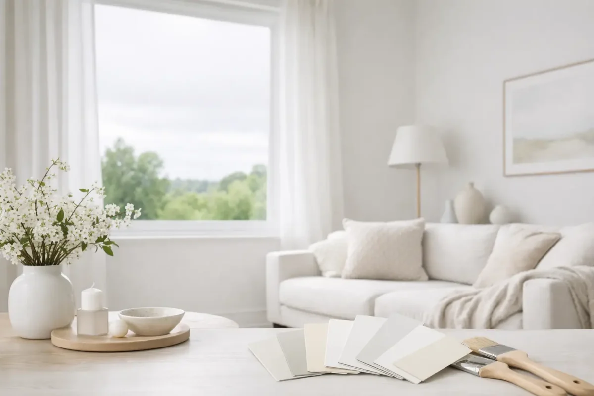
Most north-facing rooms do not need a brighter white. They need a warmer one.
That is the short answer to the search for the best white for north-facing rooms. If a room receives little direct sun, a crisp blue-white usually reads grey by mid-afternoon. What looked clean on a paint card can feel flat on a wall. The fix is not guesswork. It is understanding undertone, daylight, and how white behaves next to flooring, joinery and lamps.
If you are painting a home to live in, this matters because the room either feels settled or mildly miserable every day. If you are furnishing a property to sell or let, it matters because cold whites make spaces photograph badly, and they tend to make inexpensive finishes look cheaper.
What is the best white for north-facing rooms?
In most cases, the best white for north-facing rooms is a soft white with a yellow, red or greige undertone rather than a stark, blue-based white. That does not mean cream. It means choosing a white with enough warmth to offset the cool cast of northern light.
In British houses, especially Victorian and Edwardian stock with 2.7 metre ceilings, one of the most reliable starting points is Farrow & Ball White Tie. It has warmth, but it is not sugary. If you want something slightly quieter and more neutral, Paint & Paper Library Salt works well. For a cleaner architectural look, but still not icy, Little Greene Shirting is often a sensible compromise.
Those are starting points, not commandments. The right answer depends on three things: how much natural light the room gets, what fixed finishes are already present, and what hour you actually use the room.
Why stark white fails in a north-facing room
North light is cool and fairly consistent. It is prized by artists for exactly that reason. It does not flatter a standard domestic room.
A brilliant gallery white can work in a large space with generous glazing, pale oak floors and proper art lighting. In an ordinary sitting room with one modest sash window, a cool white often picks up blue or green notes. Pair that with a grey sofa and a stone floor, and the whole room can feel as if the heating is broken, even when it is not.
This is where people get caught. They ask for “bright” and are given something technically whiter. On a wall, that often reads darker, because the undertone turns the light cold. Warm whites reflect light in a way that feels gentler and more usable.
The same rule applies in many new-build flats. North-facing open-plan spaces with aluminium-framed glazing can be particularly unforgiving. Hard finishes, hard light, hard white. It is rarely the look anyone was hoping for.
Start with undertone, not brand
Paint brands matter less than undertones. Two sample cards can look almost identical under shop lighting and behave very differently in your room.
A useful way to sort whites is by family. Blue-based whites are crisp and can look sharp in south-facing rooms. Green-based whites can feel fresh, but in a cool room they often turn sallow. Yellow, red and putty-based whites are generally safer in north-facing spaces because they add back some of the warmth the daylight removes.
That is why decorators often reach for shades that sit just off white. Farrow & Ball School House White, Edward Bulmer Jonquil, and Mylands Lamb’s Ears all have enough body to avoid that paper-strip effect. They do not shout their undertone, but they are doing useful work.
If you already have a pink-beige limestone floor or warm engineered oak, you can afford a more restrained white. If your floor is a cool grey porcelain, you may need more warmth in the paint than you think. Rooms are read as a whole, not wall by wall.
Test the white at the right size
A paint card is too small to judge the best white for north-facing rooms. You need an A4 sample at minimum, and ideally a painted board around 600mm by 800mm.
Paint two coats. Move the board around the room. Check it at 8am, 1pm and 5pm. Then check it with the lamps on.
That last step is where many decisions go wrong. A north-facing room in Britain is often used under artificial light for much of the year. If your bulbs are 2700K, a warm white can look elegant and calm. If your bulbs are 4000K, the same wall may look oddly beige. The paint is not the only variable. The lamp colour temperature is part of the scheme.
As a rule, use 2700K in living rooms and bedrooms, and 2700K or 3000K in kitchens, depending on how crisp you want task areas to feel. Anything cooler in a north-facing domestic room tends to fight the paint.
The best white changes with the room’s job
A north-facing bedroom can take more warmth than a north-facing kitchen. That is because you want a bedroom to settle. A kitchen usually needs a touch more clarity.
In a bedroom, something like Farrow & Ball Dimity or Little Greene Slaked Lime Mid can work beautifully if you want softness without obvious cream. Pair either with natural linen, antique brass and timber with some age to it, and the room will feel composed rather than decorated.
In a kitchen, I would usually keep the walls warmer than pure white but avoid anything too buttery. Paint & Paper Library Slate II on cabinetry with a softer white on walls can work better than forcing every surface into one so-called clean white. On Shaker joinery, deVOL’s approach is a good lesson here. Their kitchens often succeed because the whites are slightly dirty, in the best sense. They have enough pigment to belong to the room.
Bathrooms are trickier. North-facing bathrooms with little daylight can make warm whites look dingy if the tiles are too cold. In that case, start with the tile and choose a white that sits beside it quietly. If the marble has blue-grey veining, choose a restrained warm white, not a yellow one. If the room is small and fully tiled, the wall colour may barely matter compared with the lighting and mirror placement.
Finish matters almost as much as colour
The same white in different finishes will look different. That is not marketing, it is optics.
Dead matt absorbs light and can make a north-facing room feel softer, but also a little flatter if there is not much contrast elsewhere. Modern eggshell or soft sheen reflects more light and can help a darker room feel livelier. On woodwork, a slight sheen usually helps define the architecture. On walls, I tend to prefer matt or very low sheen, especially in older houses where you do not want every surface imperfection announcing itself by tea time.
Ceilings deserve thought too. Painting the ceiling in the same white as the walls often works well in a north-facing room because it removes a hard line and lets the room feel more enveloping. This is particularly useful in smaller reception rooms and box bedrooms. If the cornice detail is handsome, keep the trim one finish higher rather than one colour colder.
Three whites I would test first
If you want a practical shortlist, test these three.
Farrow & Ball White Tie is a good first sample for traditional rooms that need warmth without obvious cream. It is particularly forgiving with oak, sisal and aged brass.
Little Greene Shirting is useful when you want a cleaner white that still feels civilised in cool light. It suits joinery-heavy rooms and works well with charcoal, walnut and blackened steel.
Paint & Paper Library Salt is a restrained, contemporary option with enough softness for a north-facing room but without drifting into beige. In a flat or newer house, it often reads quietly expensive.
There are others worth trying. Benjamin Moore Swiss Coffee has devotees for a reason, though always sample it carefully in UK light. Mylands Wood Ash can also be excellent where you want a chalkier, slightly more architectural white.
One dry note from practice: if someone tells you there is one universally best white for north-facing rooms, they are either selling paint or have not had to match it to a pink stone floor installed by somebody else.
A final rule helps. Choose the warmest white that still reads as white against your fixed finishes. That is usually where the room lands properly.
If you are stuck, sample three, not ten. Put them on large boards, look at them for two days, and reject the one that turns grey at dusk. The right white is rarely dramatic. It just makes everything else in the room look more intentional.