
How High to Hang Art, Properly

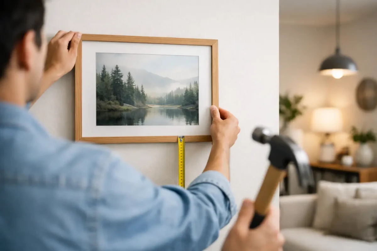
Most art is hung too high. You can test that claim in almost any hotel, show home or newly furnished flat: the picture sits nearer the ceiling than the furniture, and the wall feels split in two. If you are asking how high to hang art, the useful answer is this: start with the centre of the piece at 145 to 150cm from the floor, then adjust for what sits beneath it.
That number matters because art is not just decoration. It sets the visual horizon of a room. Get it wrong and even good furniture from the right houses – say a George Smith sofa, a Pinch side table or a clean-lined Gubi console – can look oddly adrift. Get it right and the room reads as resolved, which is what buyers, guests and owners tend to register before they can explain why.
How high to hang art on a plain wall
For a single picture on an otherwise open wall, hang it so the centre lands at roughly 145 to 150cm above finished floor level. Galleries often work around 145cm. In domestic rooms, especially those with generous ceiling heights, 150cm can feel slightly more natural. The difference is small, but rooms are made of small differences.
Why the centre line, rather than the top edge? Because frames vary. A small Piero Fornasetti print in a slim ebonised frame and a large abstract in a 7cm oak frame should not share the same top line. Your eye reads the image mass, not the builder’s tape measure. The centre line keeps unlike pieces visually disciplined.
If your ceilings are very high, resist the urge to push the art upwards to “fill” the wall. That usually makes the room feel colder, not grander. Georgian houses, Victorian villas and many newer developer units all suffer from this in different ways. Height on the wall is not the same thing as presence in the room.
How high to hang art above a sofa or console
When art sits above furniture, the rule changes slightly. Now you are not only placing art on a wall, you are connecting two objects into one composition. Leave roughly 15 to 25cm between the bottom of the frame and the top of the sofa, sideboard, console or headboard.
Closer often looks better than people expect. A gap of 18cm above a sofa usually feels intentional. A gap of 35cm starts to feel like the picture missed its landing. This is the mistake I see most often in furnished rentals and sale properties, where artwork is treated as a final layer rather than part of the room’s structure.
Scale matters too. The art should usually be around two-thirds to three-quarters the width of the furniture below. Above a 240cm sofa, that might mean one large 160cm-wide piece, or a pair of 70cm frames with a modest gap. Above a 120cm console, a 90cm landscape often sits better than two apologetic little prints.
There are exceptions. If you are hanging a deliberately small 19th-century study above a substantial antique chest, the contrast can be charming. But it must look deliberate, not underfunded.
How high should a gallery wall hang?
A gallery wall still needs one centre line. Treat the whole arrangement as if it were a single large artwork and place its visual centre at about 145 to 150cm from the floor. Then build around that.
People often start at the top and work down. That is how gallery walls end up climbing towards the cornice. Start instead with the anchor piece, usually the largest or most important work, placed near the centre-line height. Then add others around it with consistent spacing, usually 5 to 8cm between frames for smaller works, or 8 to 10cm for larger ones.
Consistency is more important than the exact dimension. If one gap is 4cm and another is 11cm, the eye sees fuss. If every gap is 7cm, the arrangement feels calm, whether the works are contemporary photographs, botanical engravings or a run of black-and-white architectural prints.
If the collection mixes periods, give them one thing in common. Matching mounts, one frame finish, or a disciplined palette is usually enough. A row that includes a vintage map, a Cy Twombly exhibition poster and family photographs can work very well if the framing does not try to make each piece shout.
Stair walls and double-height spaces need a different logic
This is where the standard advice breaks down. On a staircase, art should follow the rise of the stairs, not a flat centre line relative to the ground floor. The cleanest method is to mark a line parallel to the handrail or stair pitch, then place the centres of the frames along that route.
Keep the distance visually even as you climb. In practical terms, the middle of each frame often ends up around 145 to 150cm above the nose line of the relevant tread, rather than above the floor at the bottom of the stair. That sounds technical, but it simply means the composition should feel level to someone walking up the stairs, not to someone holding a laser measure in the hall.
In double-height spaces, use art to relate to the occupied zone, not the void above it. If there is a sitting area at the base of a tall wall, hang the work in relationship to the seating group. Do not centre a painting midway up a six-metre wall unless you want everyone to need binoculars. Large walls need larger art, not higher art.
A useful property note here: in entrance halls for sale or let, oversized art hung too high can make the space feel more expensive but less humane. Buyers and guests tend to respond better to work that connects with the body at eye level. Grandeur has its place. So does comfort.
The frame, mount and room all affect the final height
This is the part many guides miss. The right hanging height is not only about the wall. It is also about what the artwork physically looks like once framed.
A substantial mount increases the visual footprint and can justify hanging a touch lower. A dark, heavy frame reads lower than a thin pale one, even when the measurements are identical. Likewise, a portrait format has more vertical pull than a low landscape, so it may tolerate a slightly lower centre point without feeling squat.
Light matters as well. In bright climates, including coastal Portugal or south-facing rooms in the UK on clear days, glare can make artwork effectively disappear if it is hung opposite strong sun. In those rooms, the answer to how high to hang art may involve a slight tilt, museum glass, or choosing a wall with less direct reflection rather than forcing the usual position.
And then there is furniture use. Above a dining room sideboard that holds lamps, the art may need to sit a little higher to clear shades. Above a bed, I am usually more cautious. Heavy glazed frames over headboards are rarely my favourite idea. If you do hang them there, keep the gap tight, fix them properly, and think seriously about weight.
A measuring method that avoids guesswork
If you want a clean result without too much theatre, do this. Measure the artwork’s full height including frame. Divide by two. Decide where the centre should sit, usually 145 to 150cm from the floor, or 15 to 25cm above furniture if hanging over a piece. Then measure from the top of the frame down to the hanging point on the back, and subtract that from your wall mark.
For example, if the framed piece is 80cm high, its centre is 40cm. If you want the centre at 148cm, the top edge wants to sit at 188cm. If the hook position is 6cm below the top of the frame, your wall fixing goes at 182cm.
That is the unglamorous side of decoration, but good rooms are often built on unglamorous arithmetic.
There is one final judgement call. Stand back before you drill the second hole. If the art relates to the furniture, the architecture and the way a person actually occupies the room, you are close. If it looks as though it is trying to impress the ceiling, lower it.
At FurnishIQ.AI powered by Tobias Oliver, that is often the difference between a room that merely contains things and one that feels finished. Start with 145 to 150cm, trust the furniture, and let the art belong to the room rather than floating above it.